As part of the semester-long assignment for a branding class ("Graphic Design 4") that I’m taking at Maryland Institute College of Art during my exchange program, I’m assigned to make a strong branding system for a made-up festival and build multiple collaterals out of the identity I created to be submitted by the end of the semester.
Tools
Adobe Illustrator, Adobe Fresco, Adobe InDesign, Adobe After Effects
Credit
Andrea Gunadi — graphic designer
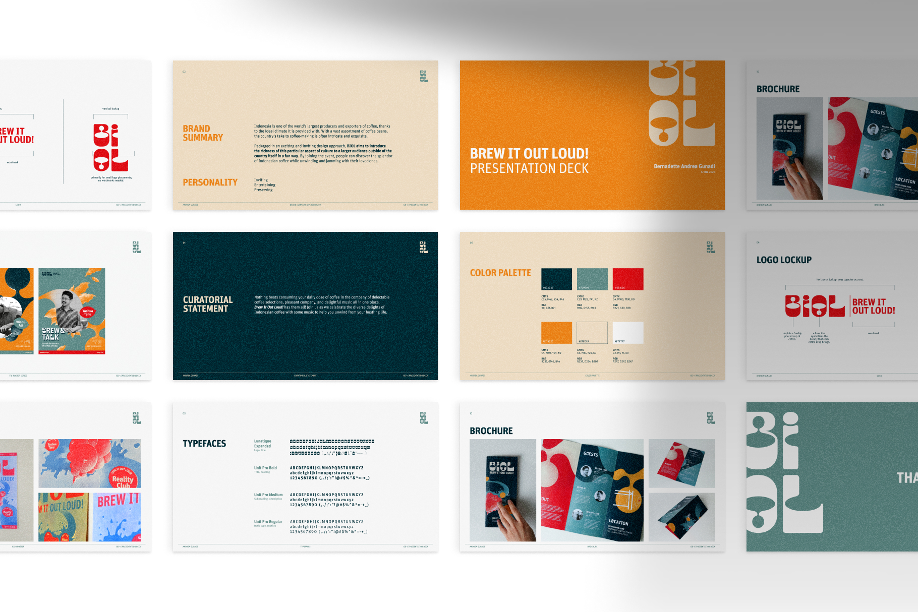
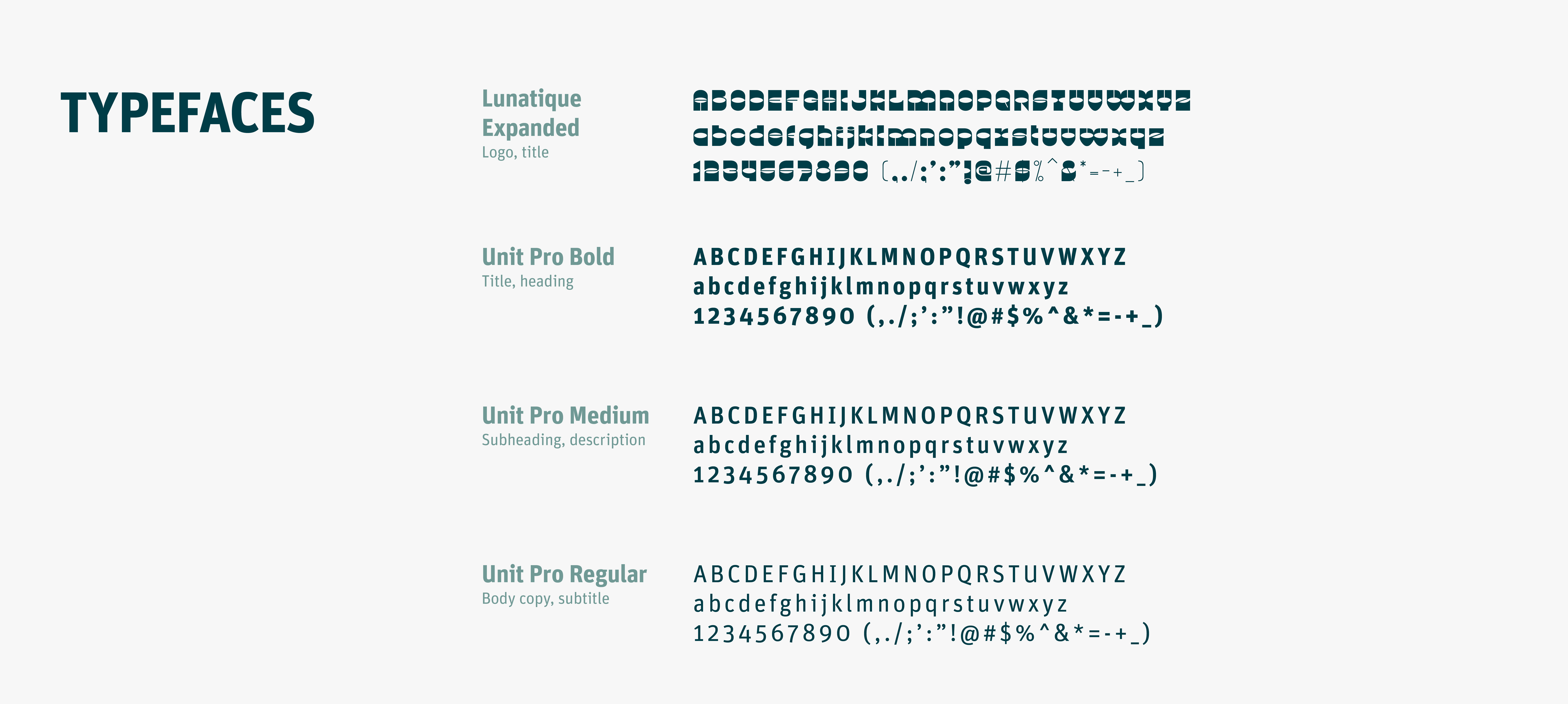
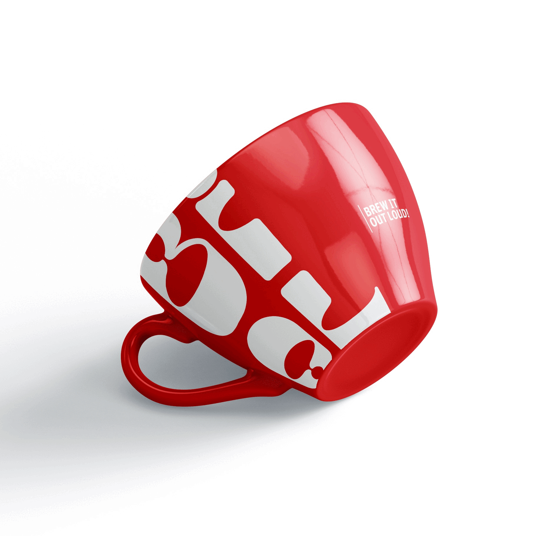
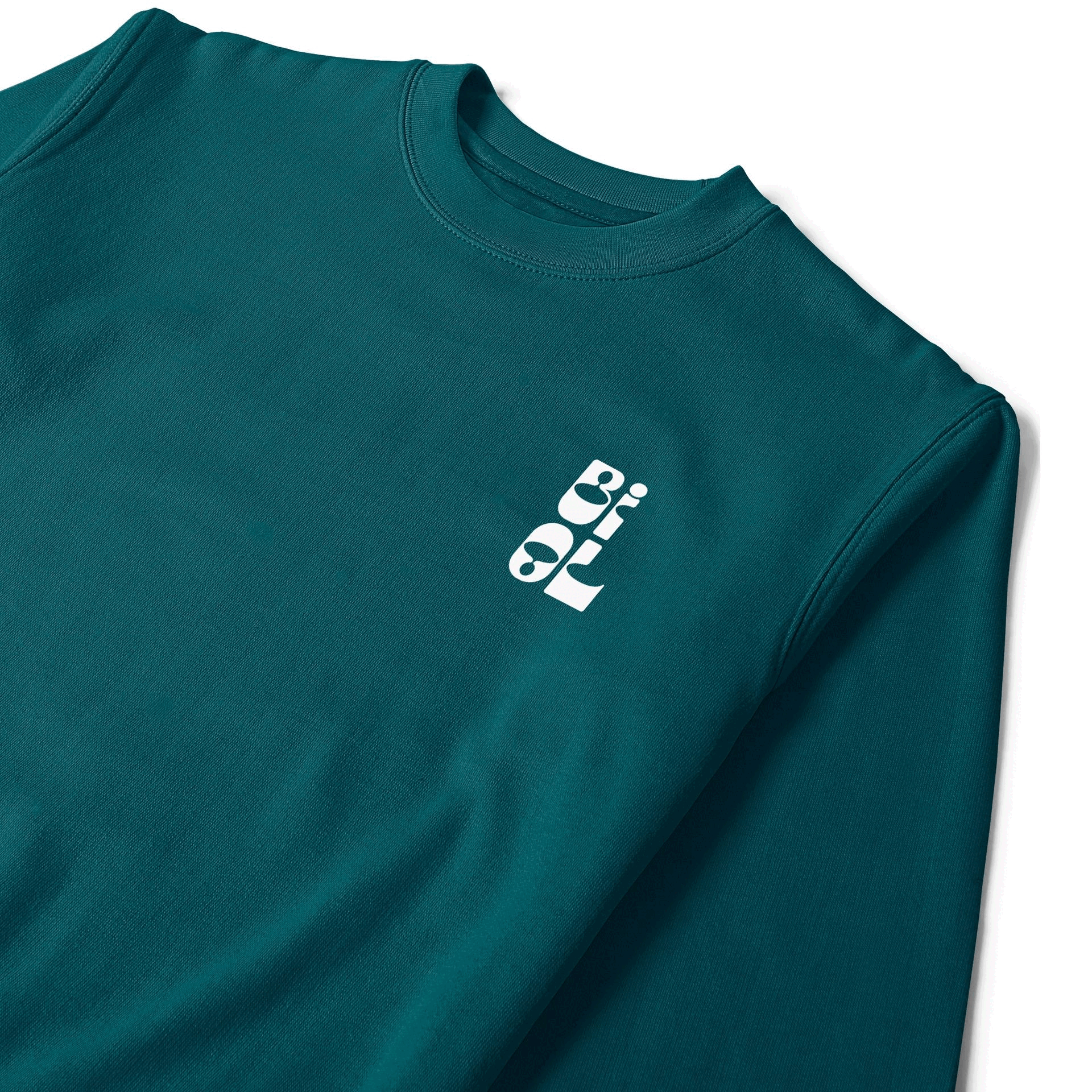
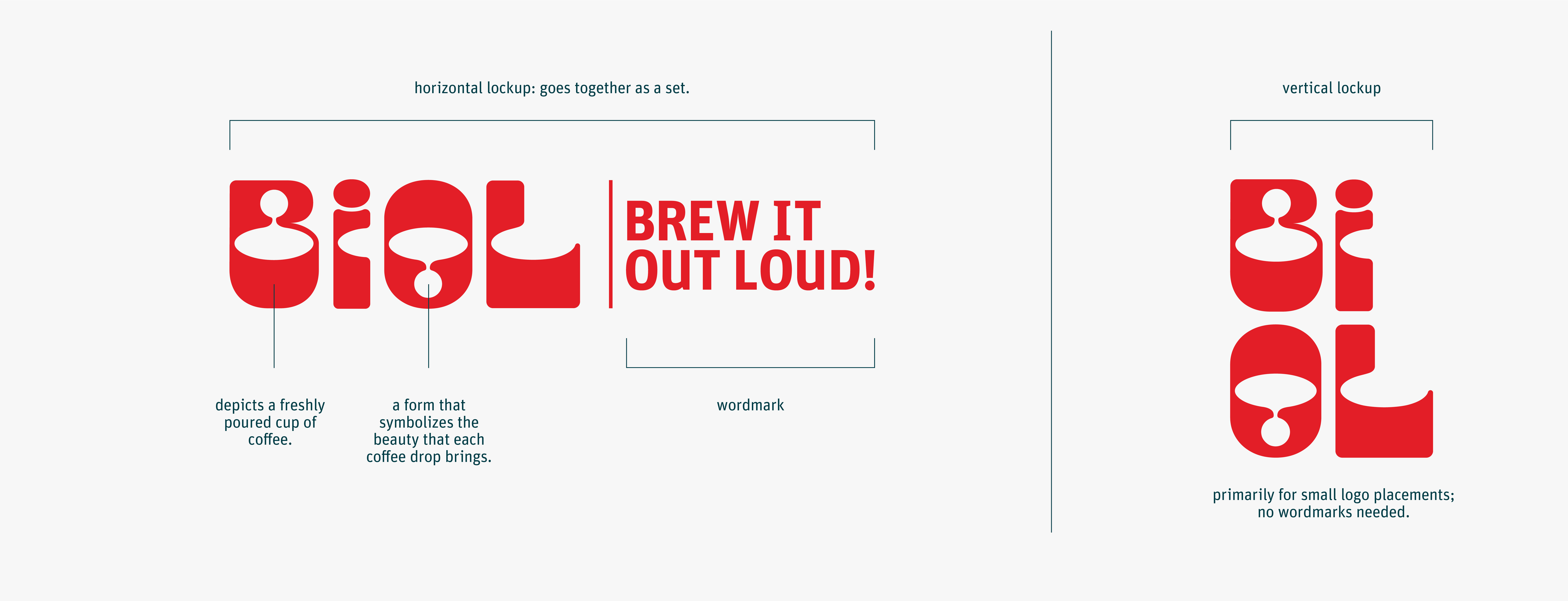
I let my imagination take me everywhere it decided to land. When I was looking for a unique and playful typeface on Adobe Fonts, I came across this typeface called “Lunatique.” The form itself attracts many possibilities to appear in my head. So, I tried various ways of putting the coffee and music festival elements of the festival into an arrangement of playful letterforms.
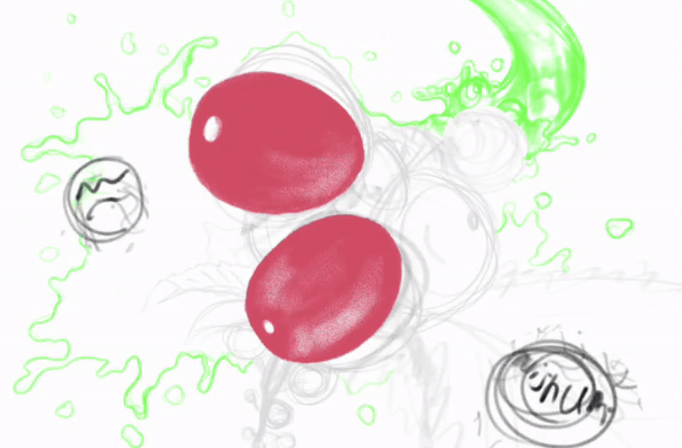
This idea of the poster was based on my intention to make it eye-catching. I figured
that by trying to make the coffee plant illustration appear from a fish-eye perspective, it could grab
more people's attention. The very close-up coffee fruits should draw our attention to the rest of the
poster.
I took a picture of my lint roller with a 0.5 wide-angle lens on my phone as a reference. From there, I
drew the digital sketch.
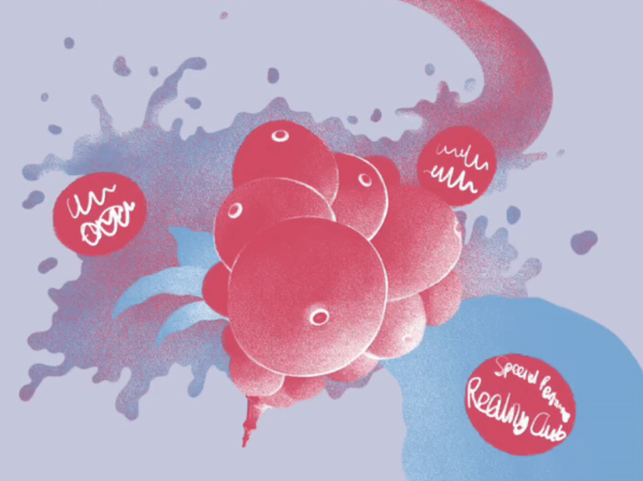
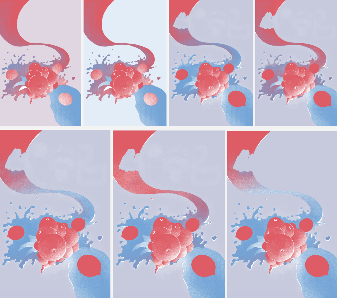
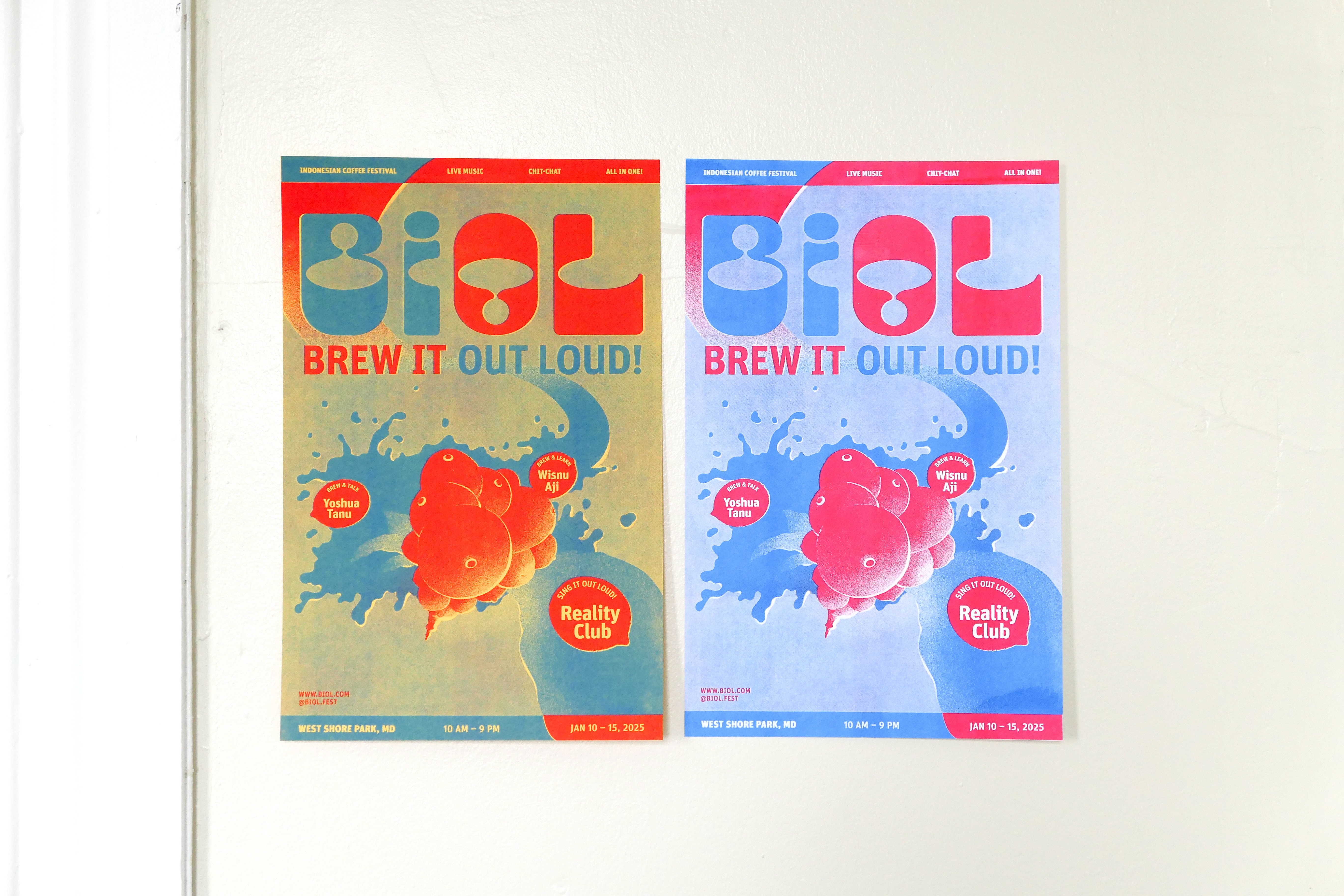
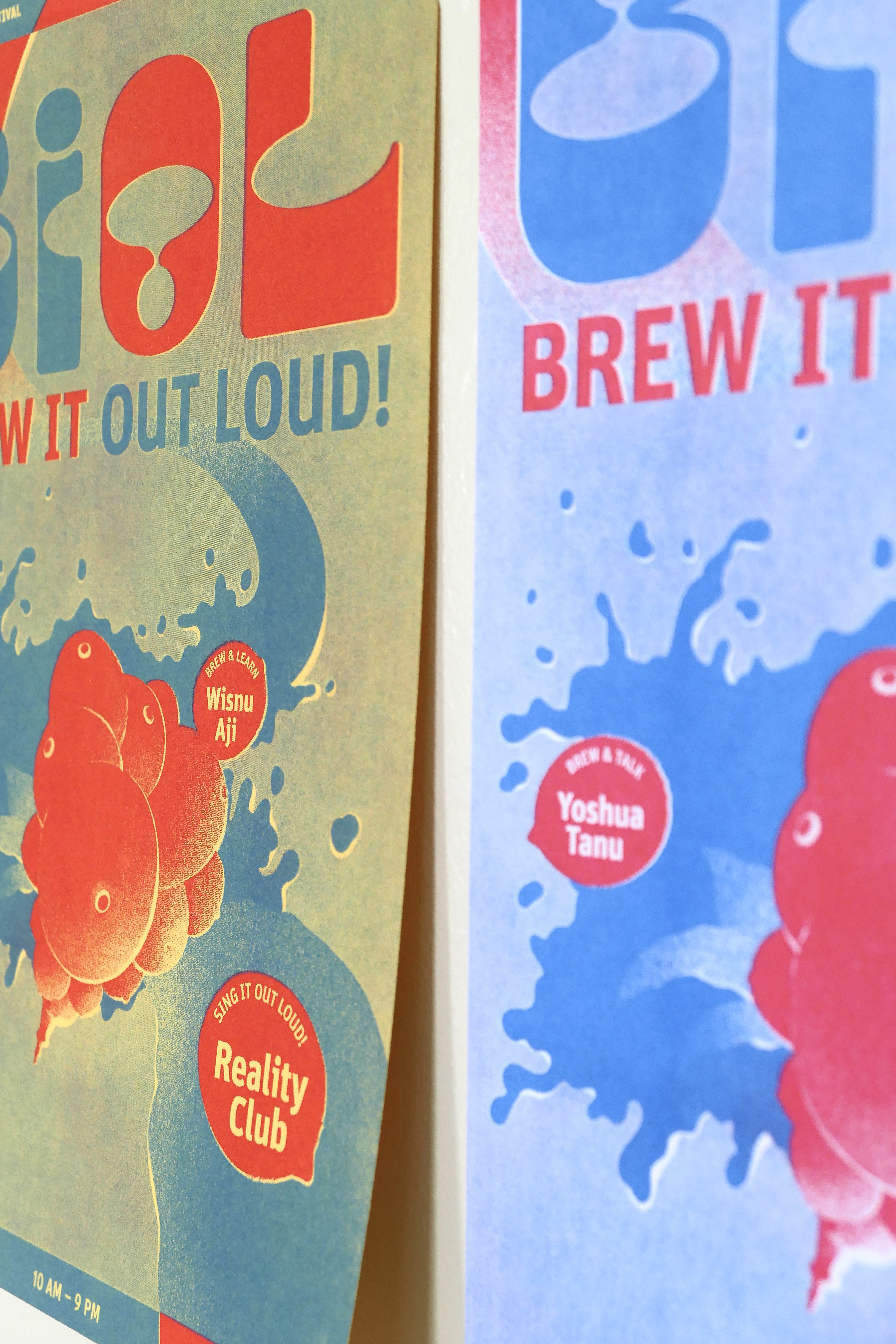
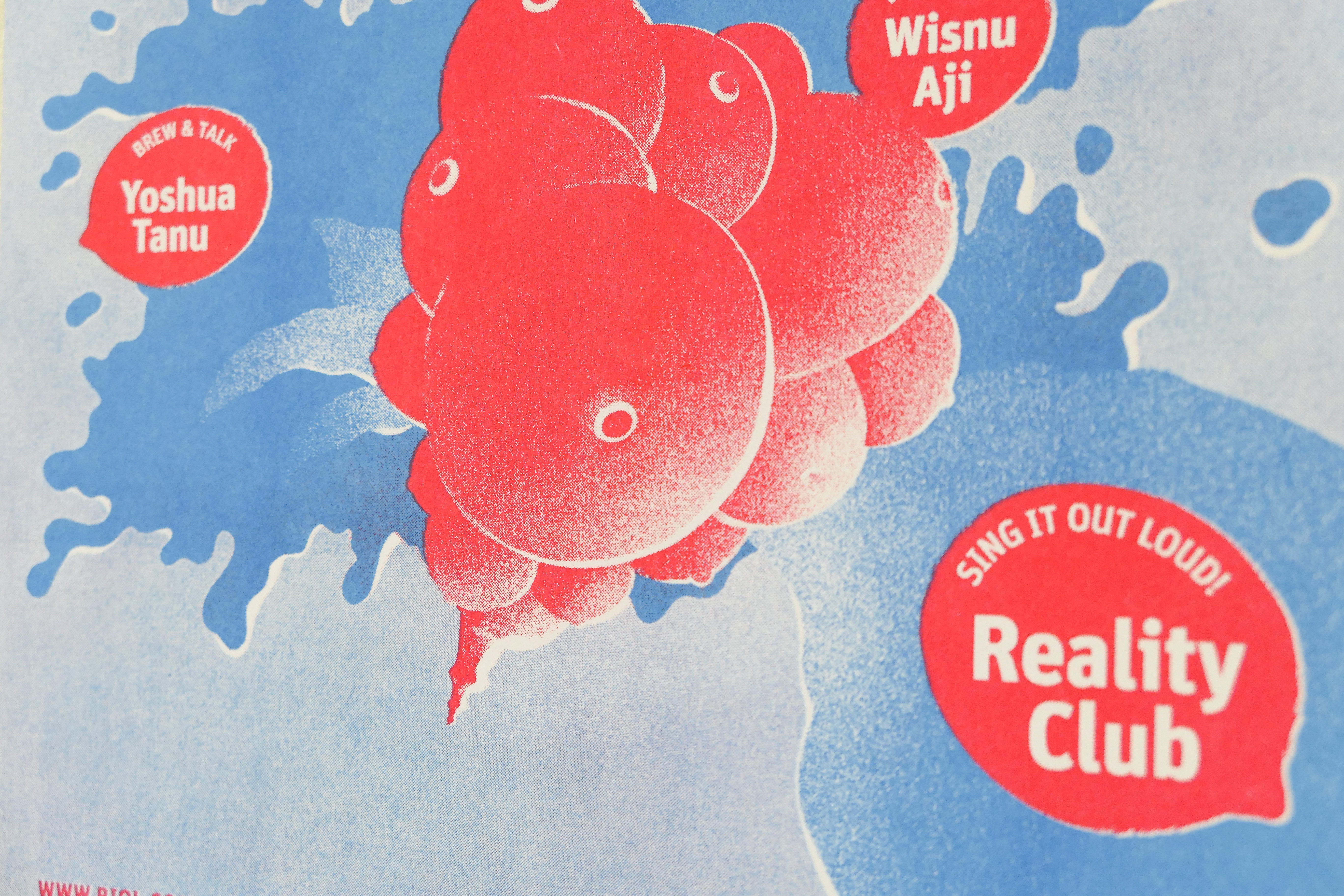
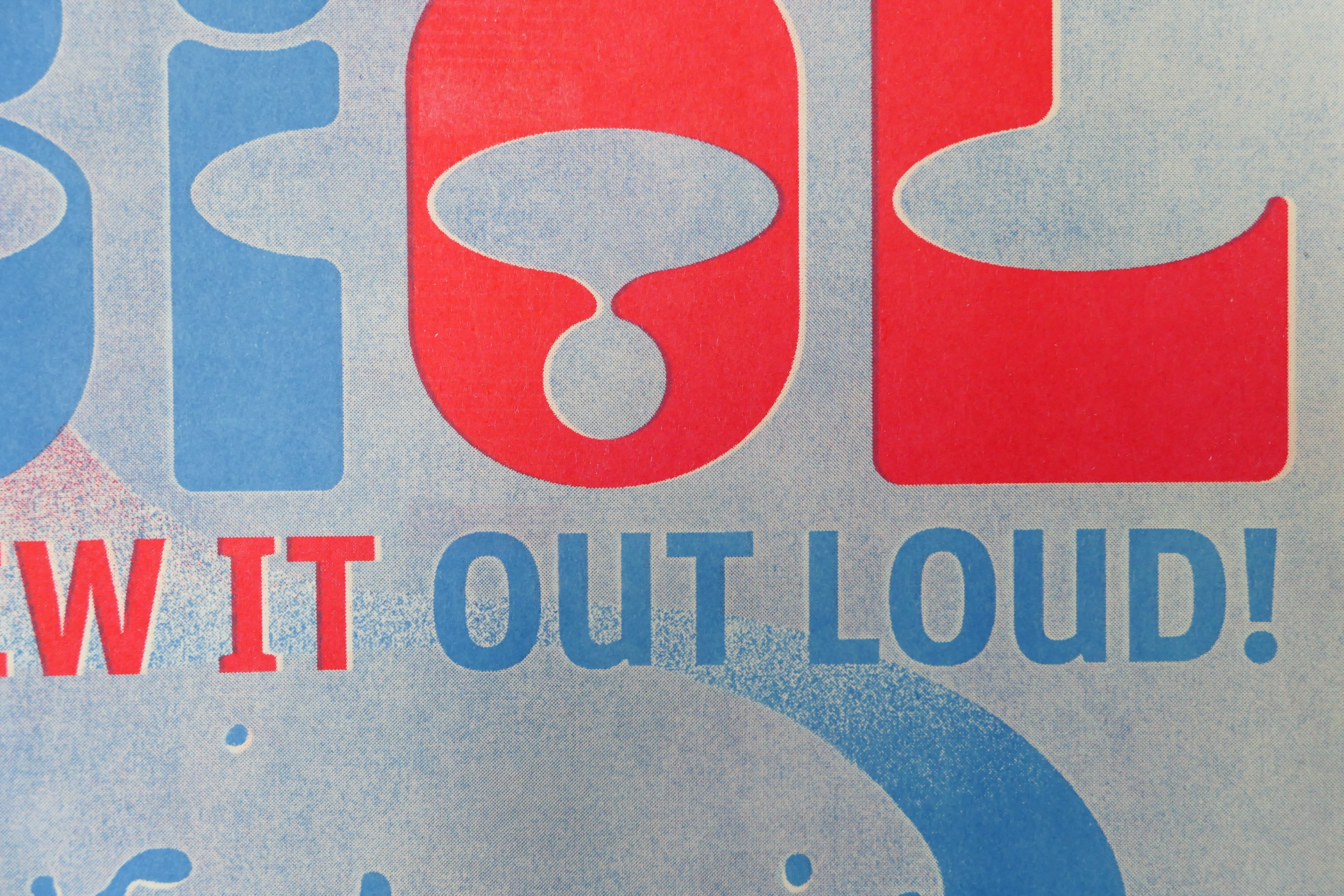
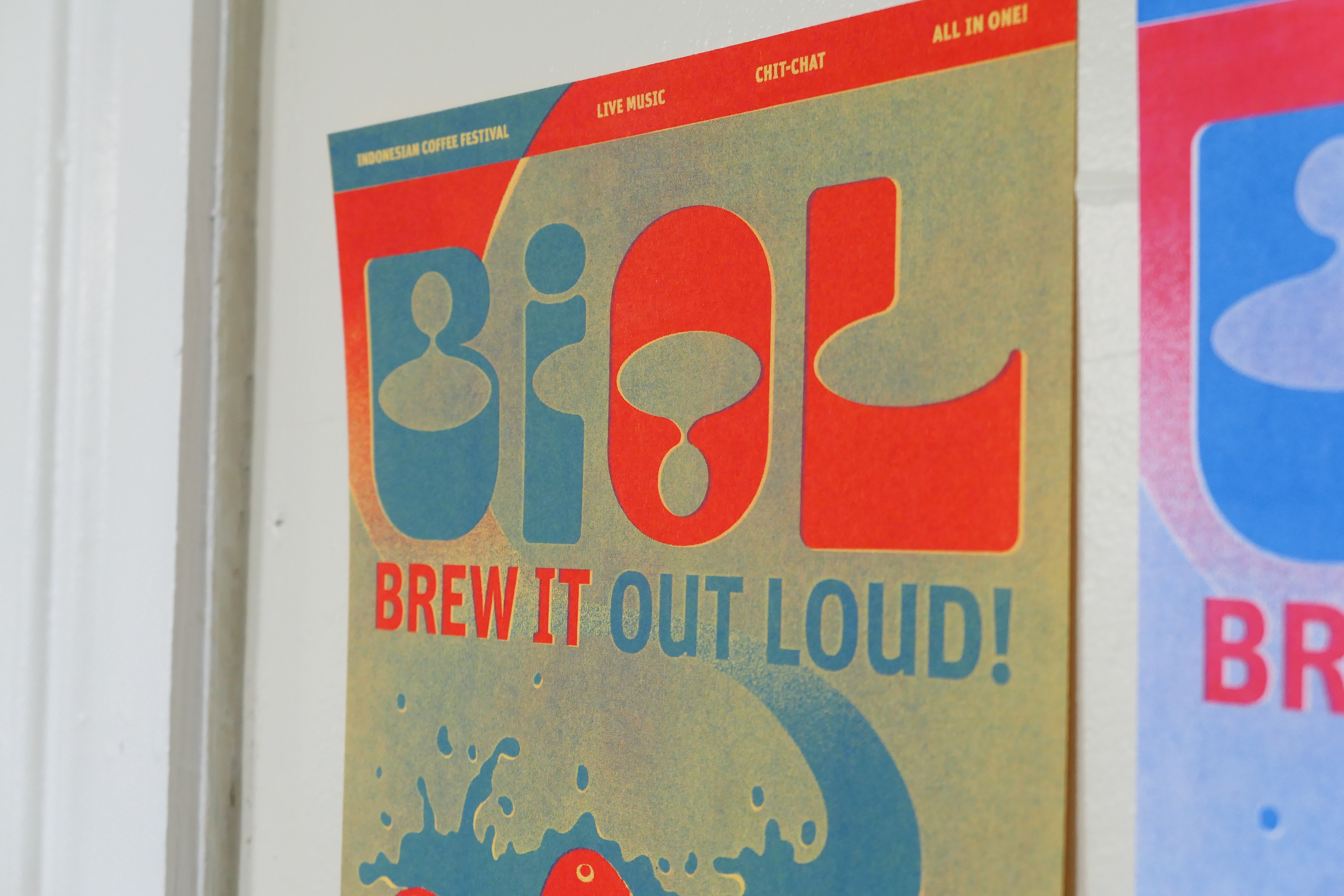
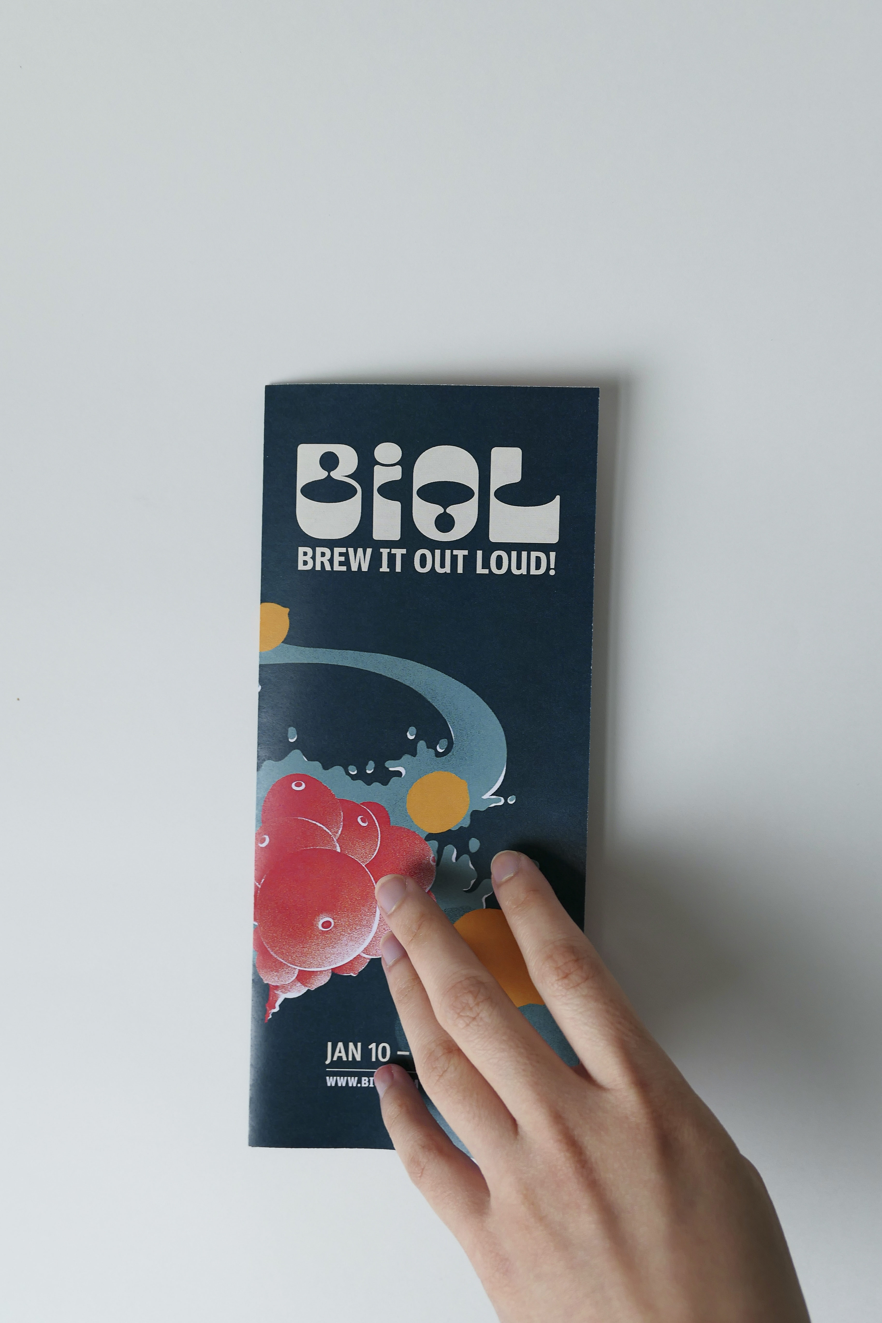
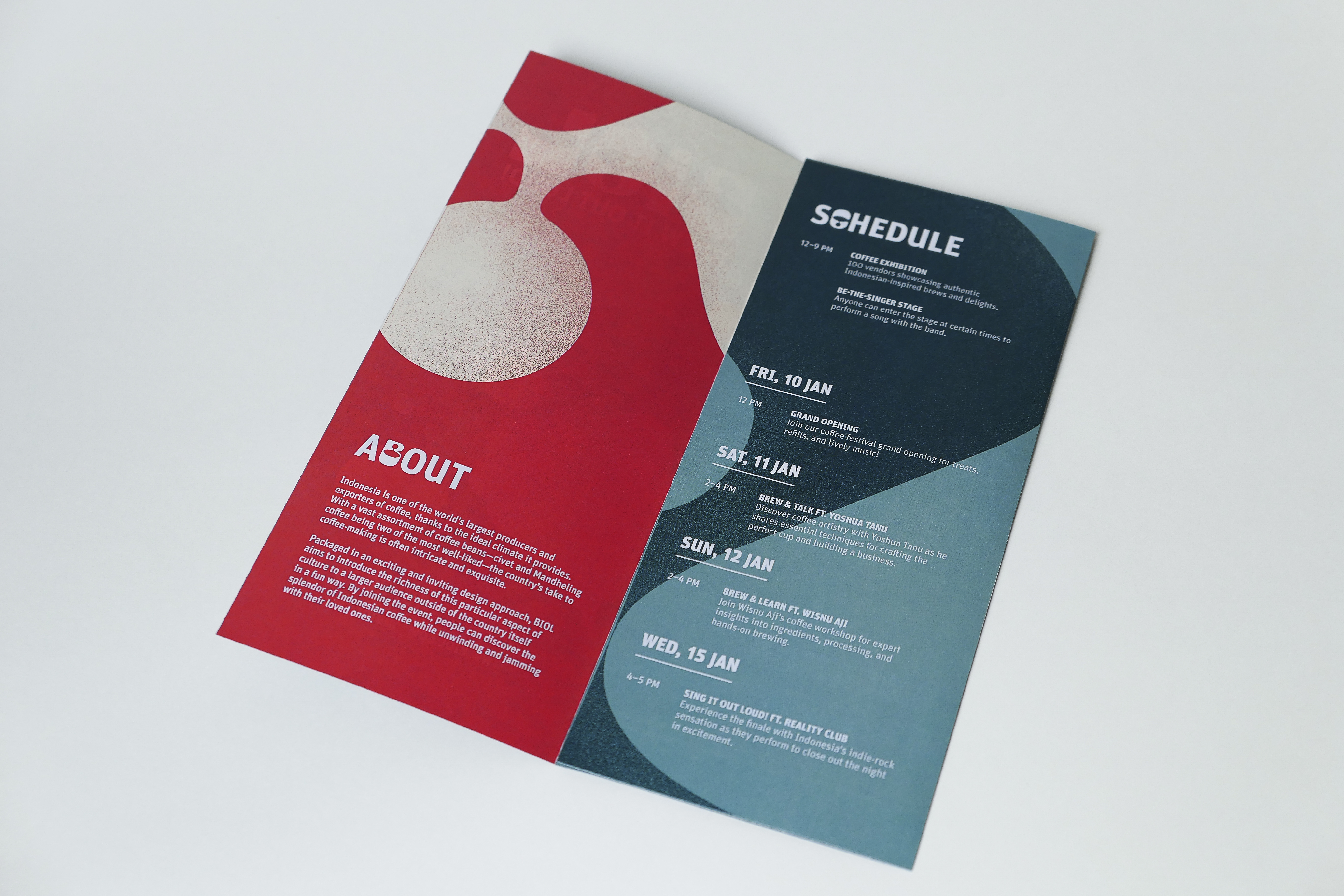
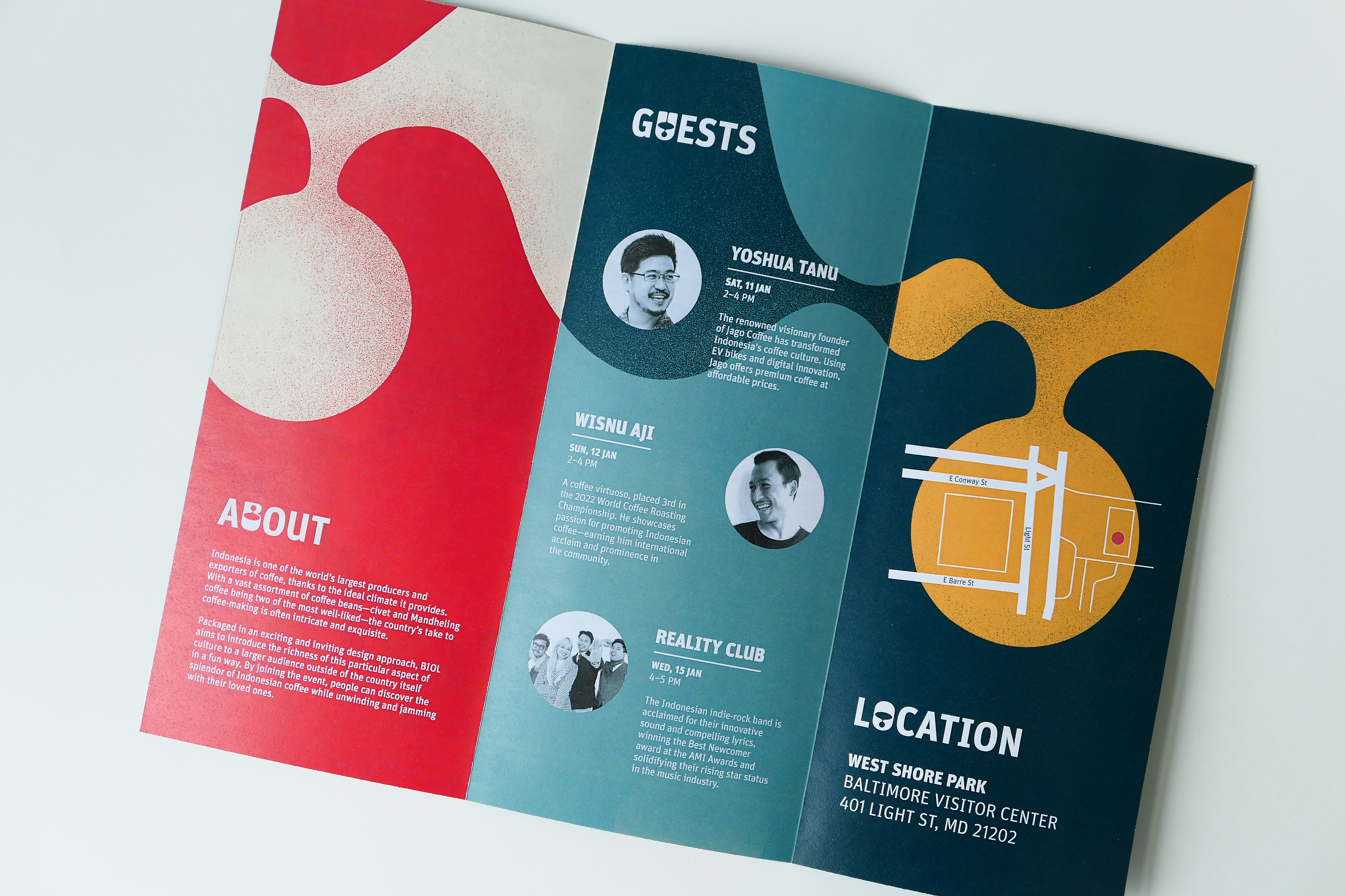
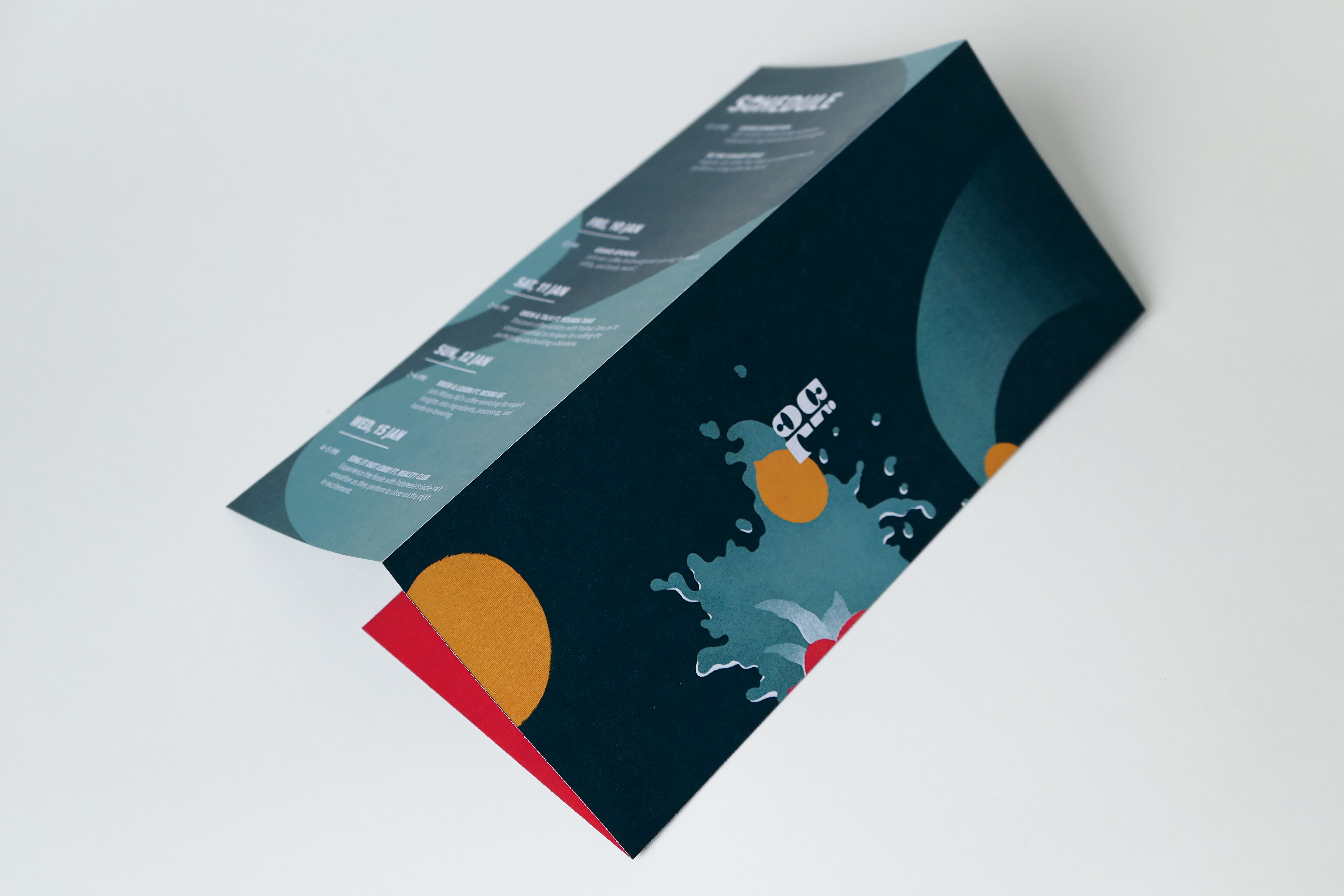
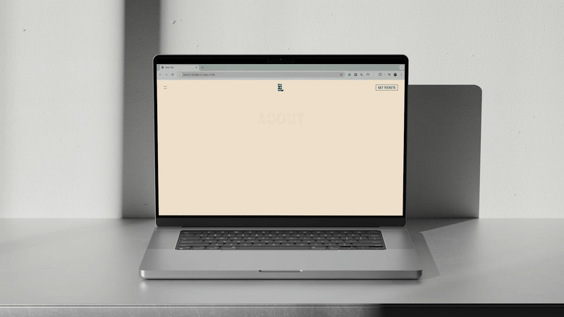
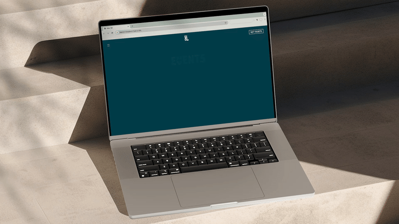
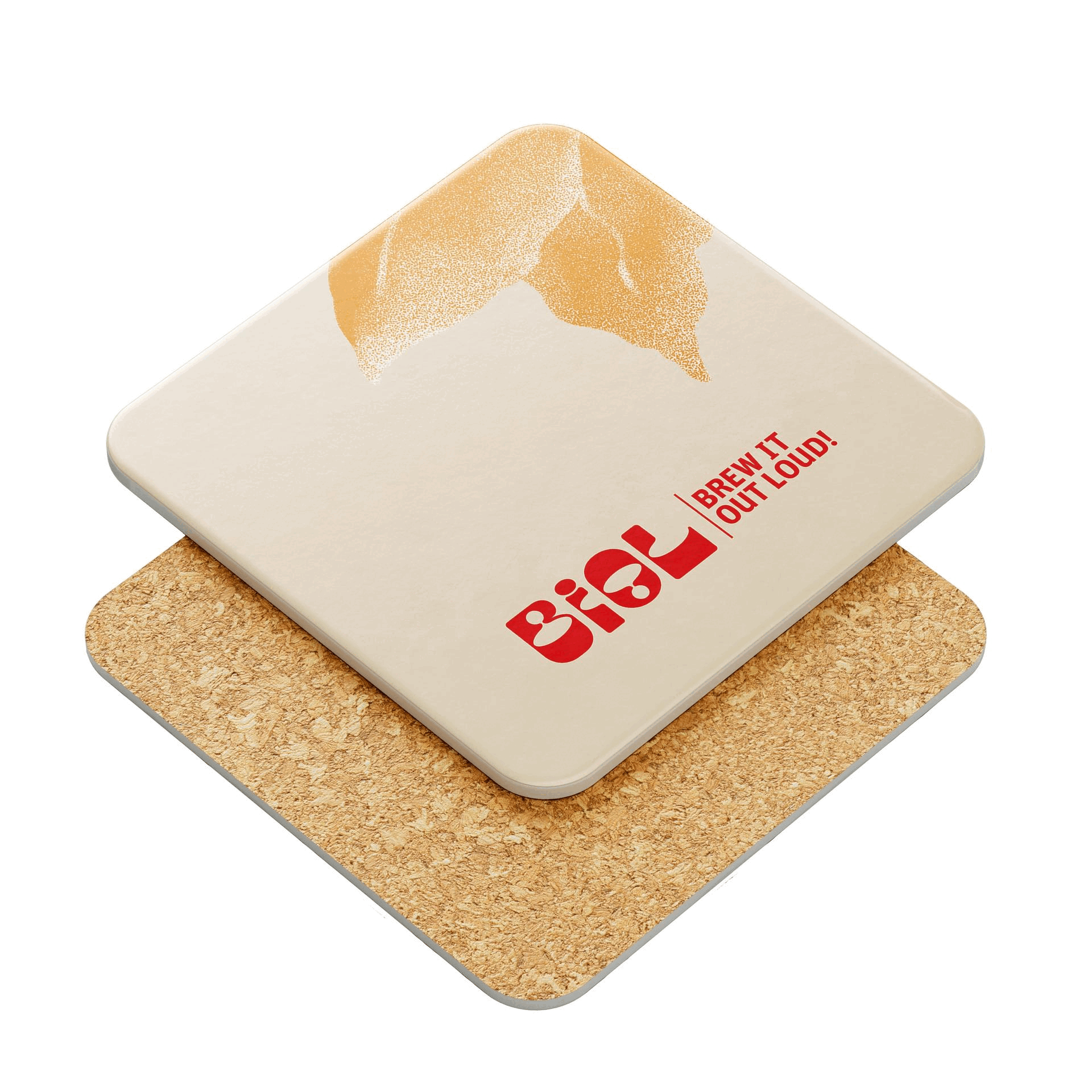
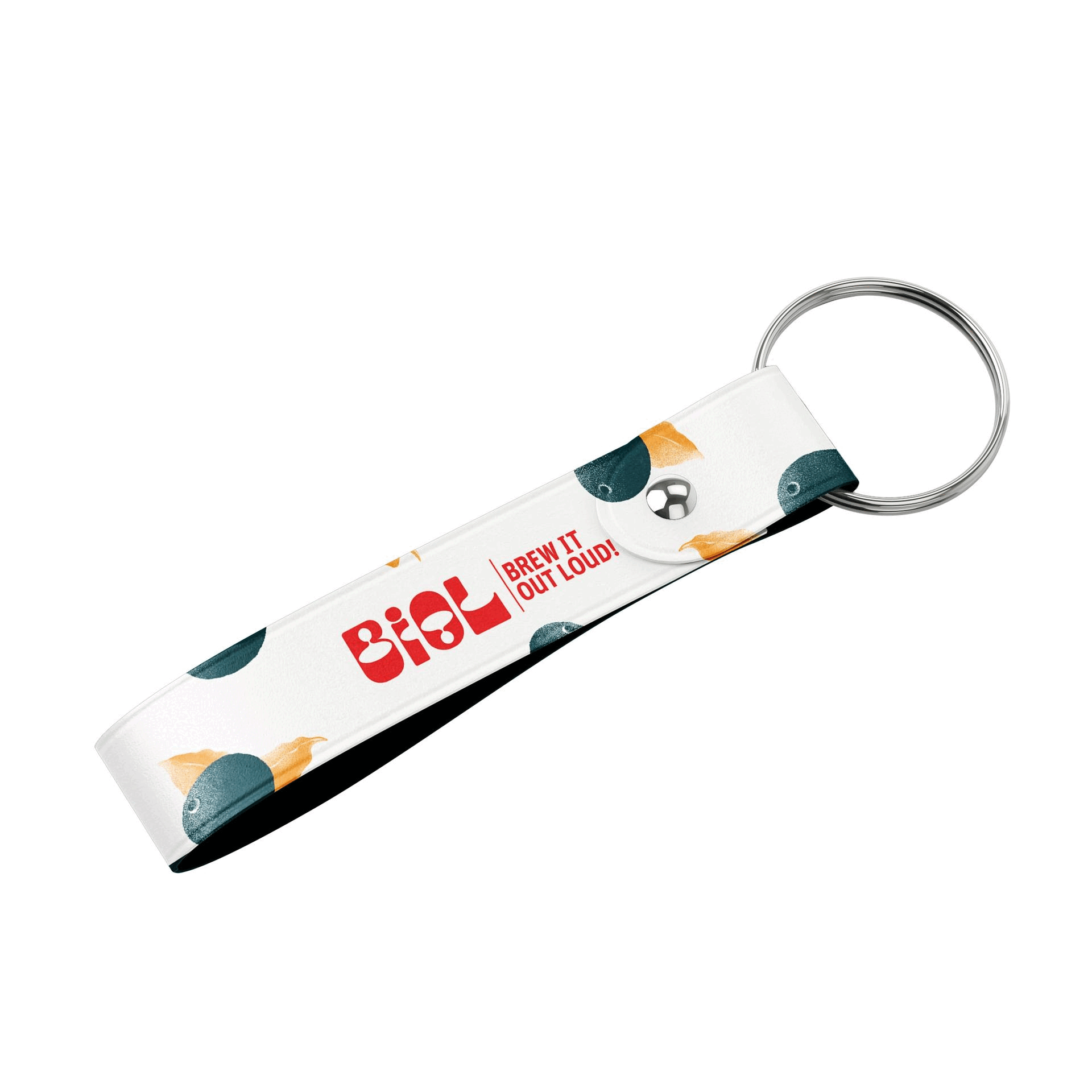
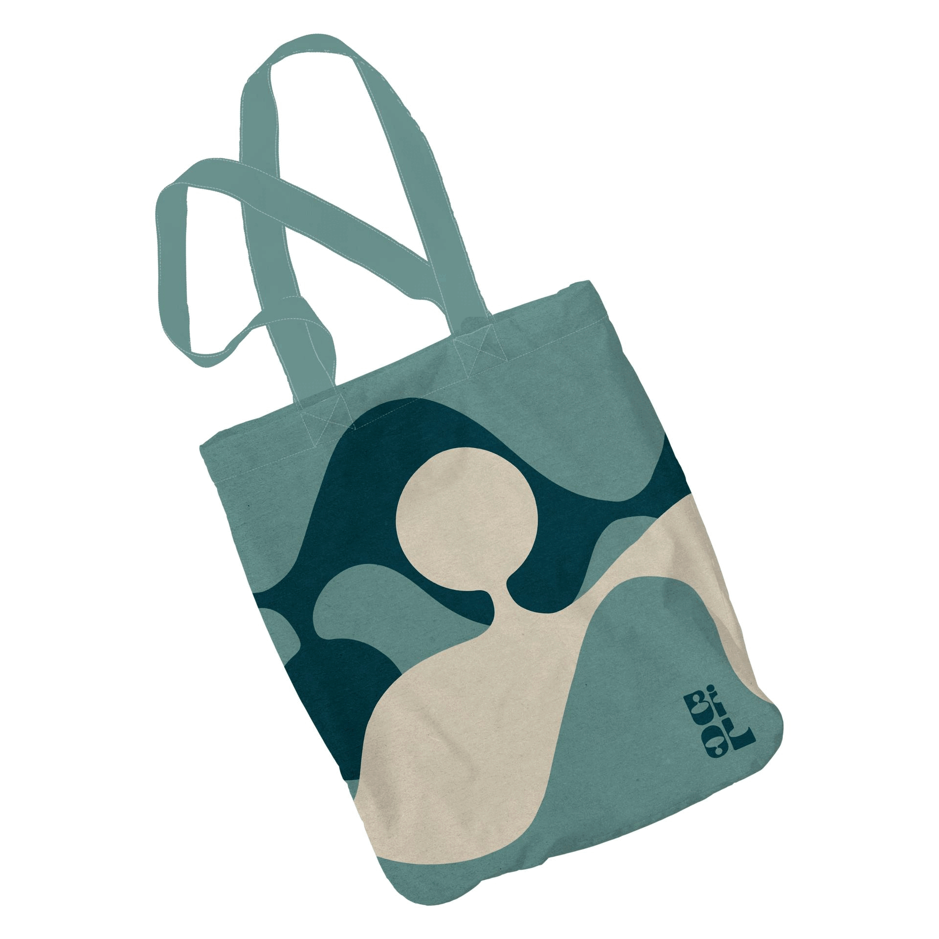
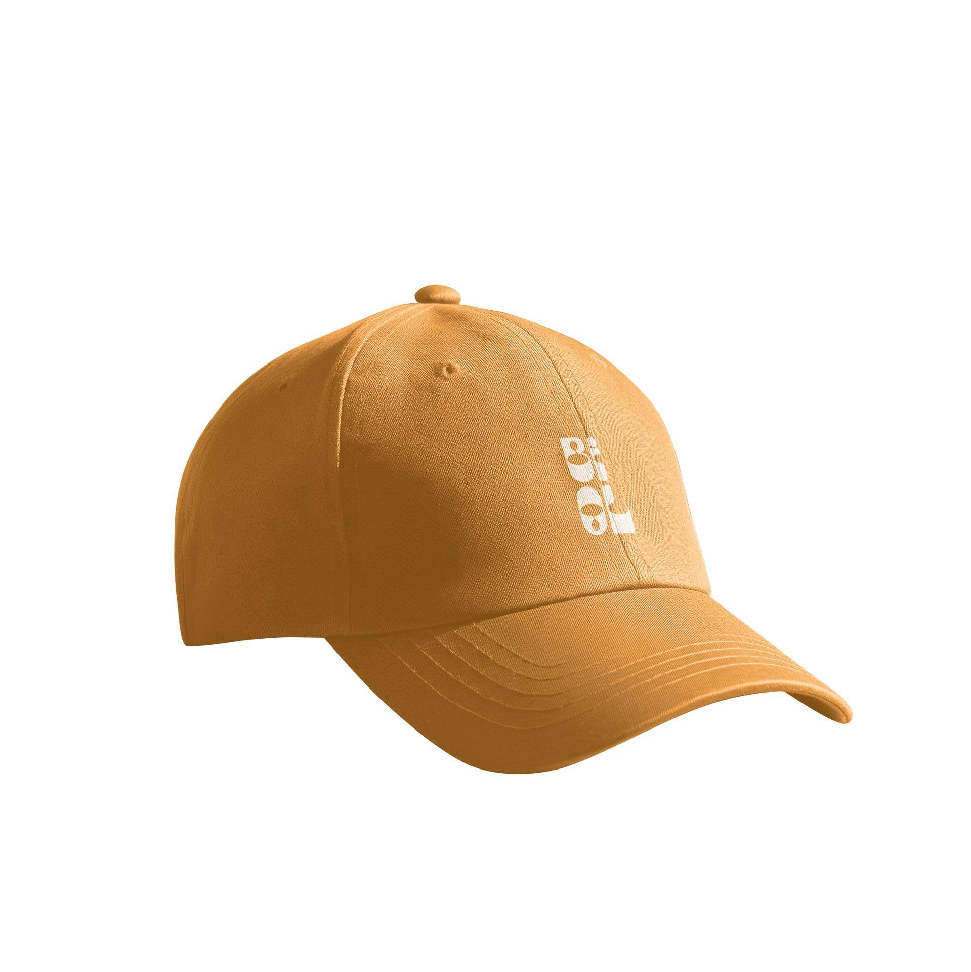
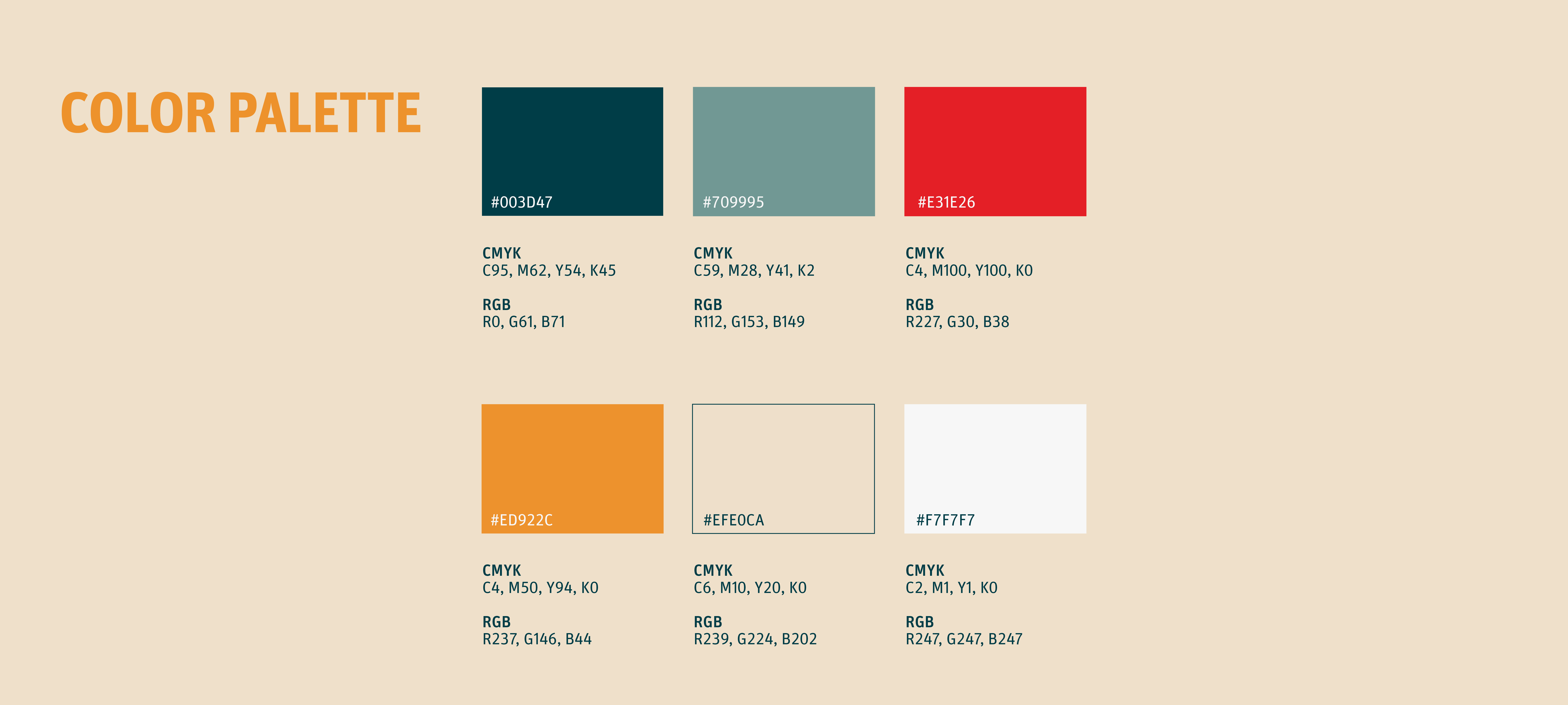
The idea: there are three main background elements that always need to be included in many parts of the festival’s design collaterals: splashes, coffee fruits, and coffee foliage. Following this system, there will be three colors set as part of the primary color palettes: the red color represents the intense, strong, and earthy flavors of coffee; the yellow color represents richness and spiciness in flavor; and the dark blue Tosca is there to set the mood to reach the intended target audience.
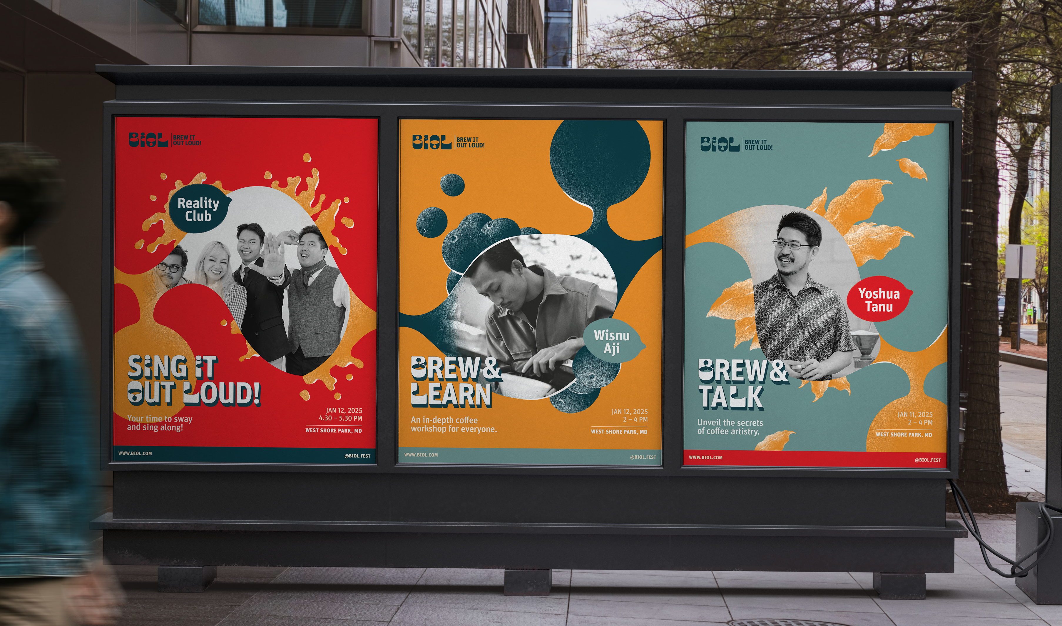
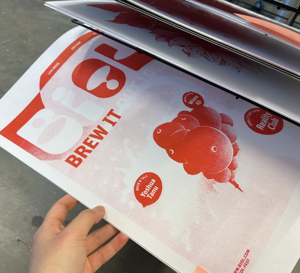
The next step was to create a tri-fold brochure containing the festival’s details and other necessary information that a visitor should know before or when coming to the event.