This project is the final product of a workshop module “Type as Grid," led by Randy Yeo.
The workshop challenged students to create a typographic work of a chosen word by strictly using modular
grids.
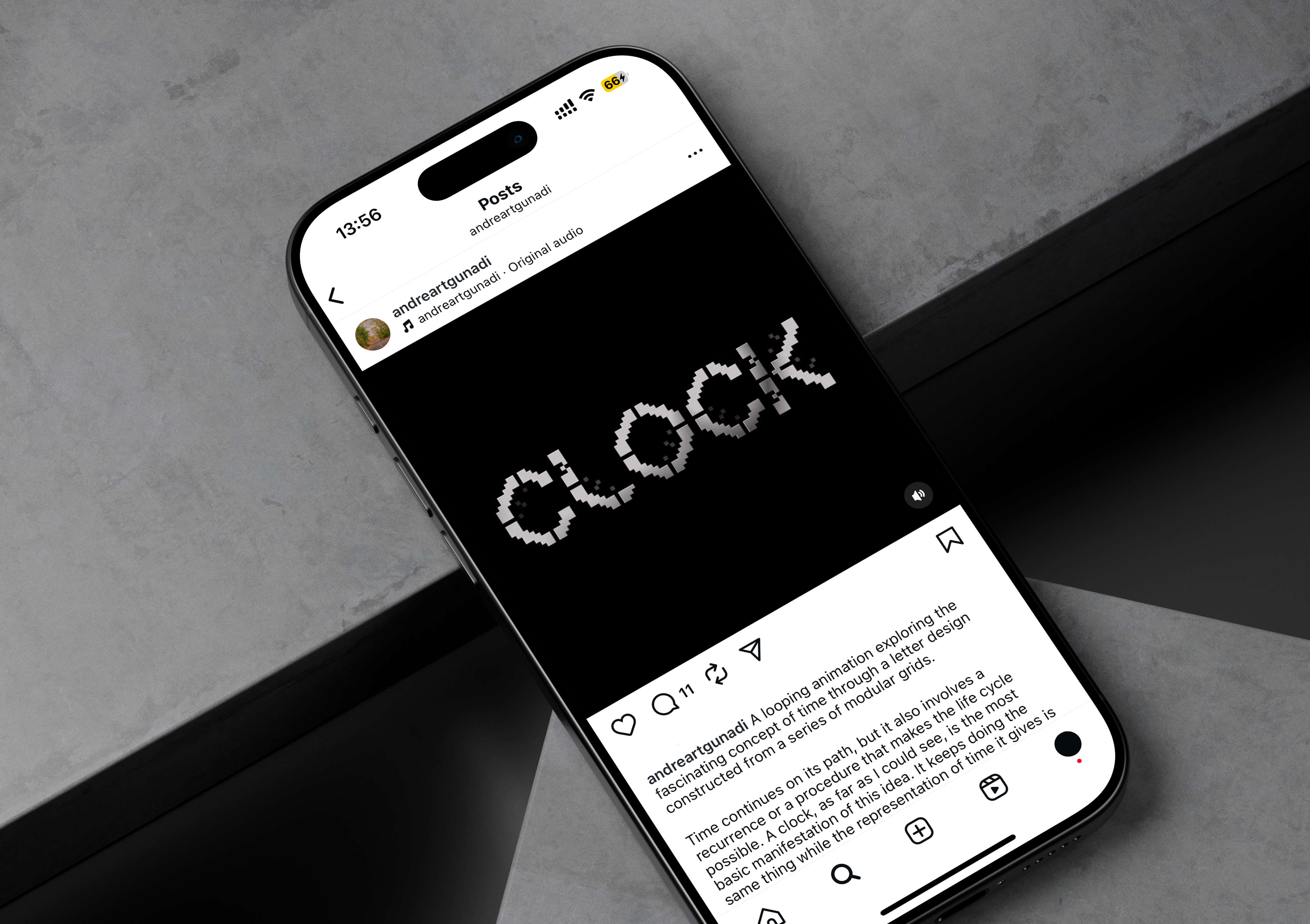
I chose to work with the word “clock” after the sight of a desk with an alarm clock caught my
eye during class. I thought it would be interesting to create alphabets inspired by the shape of clocks
and the concept of “time”.
The word “time” itself can be taken both literally and conceptually.
By embodying a clock, I am also indirectly and very directly presenting the concept of time.
Tools
Pencil, printed modular grids, Adobe Illustrator, Adobe After Effects.
Credit
Andrea Gunadi — type designer, motion and graphic designer
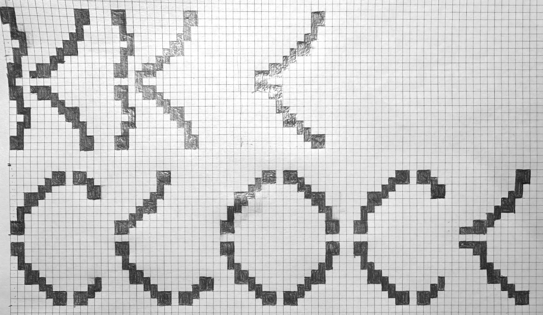
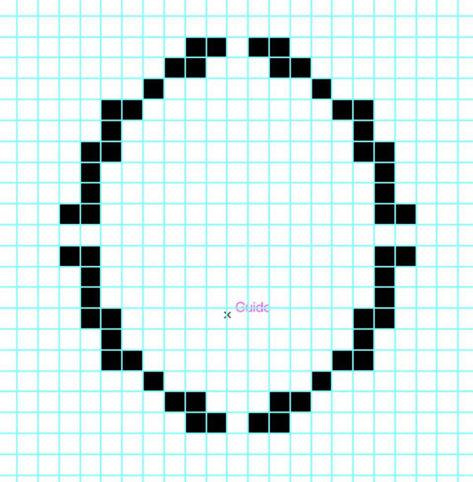
In the first step of designing the letters, I built the shape of the letter “c” based on the prominent features an alarm clock usually has: a circular base with two ears popping out. I also tried to include the clockwork center. I found the center cross to look a bit awkward and unnecessary, so I explored different possibilities.
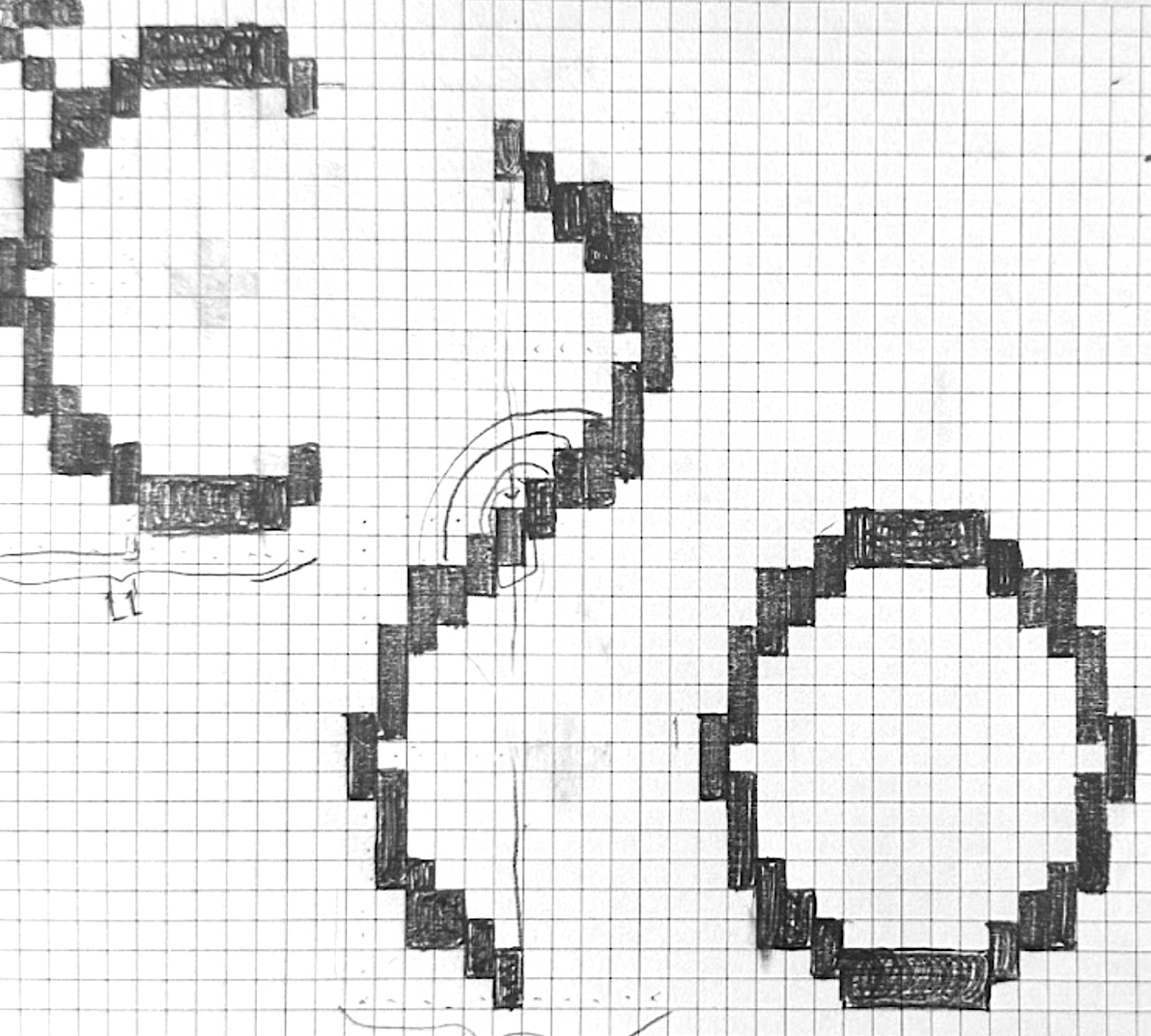
Midway through the designing process, I emphasized the element that makes a clock
immediately recognizable, which is the four-hour hands for 12, 3, 6, and 9. So, I cut out all circular
letters into four partitions to make the structure more clock-like.
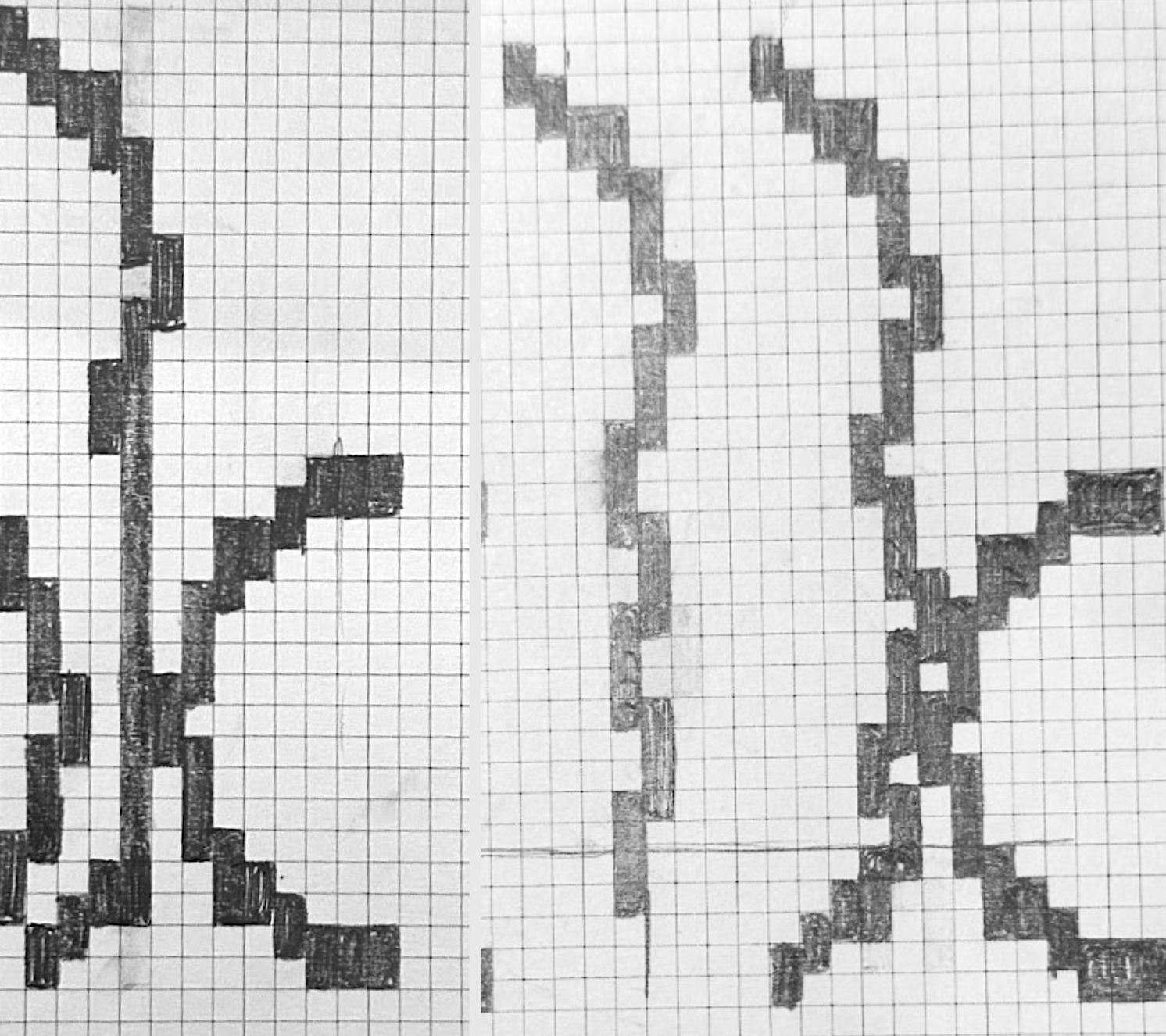
The existence of the stems on the “l” and “k” looks like an extension of the letters that are already
legible without them. To satisfy this curiosity, I decided to try designing the uppercase version
of it.
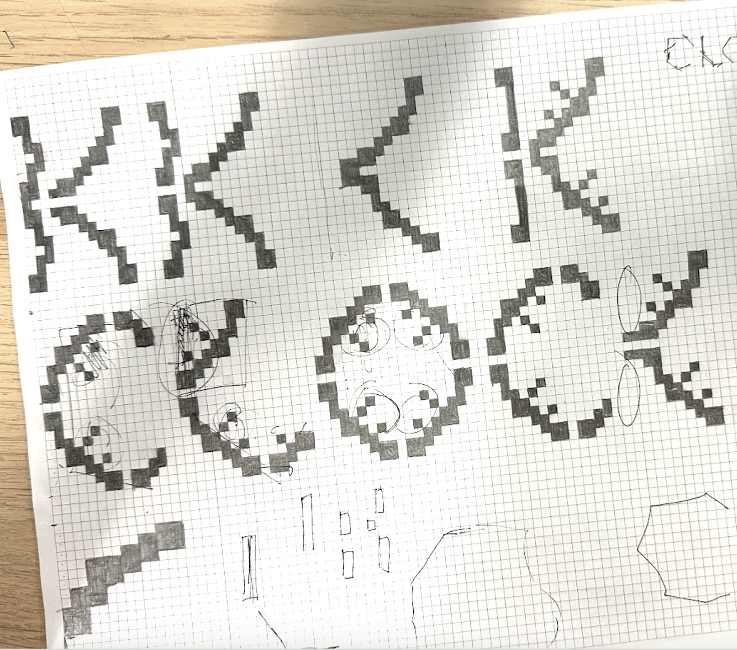
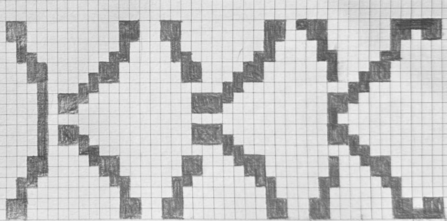
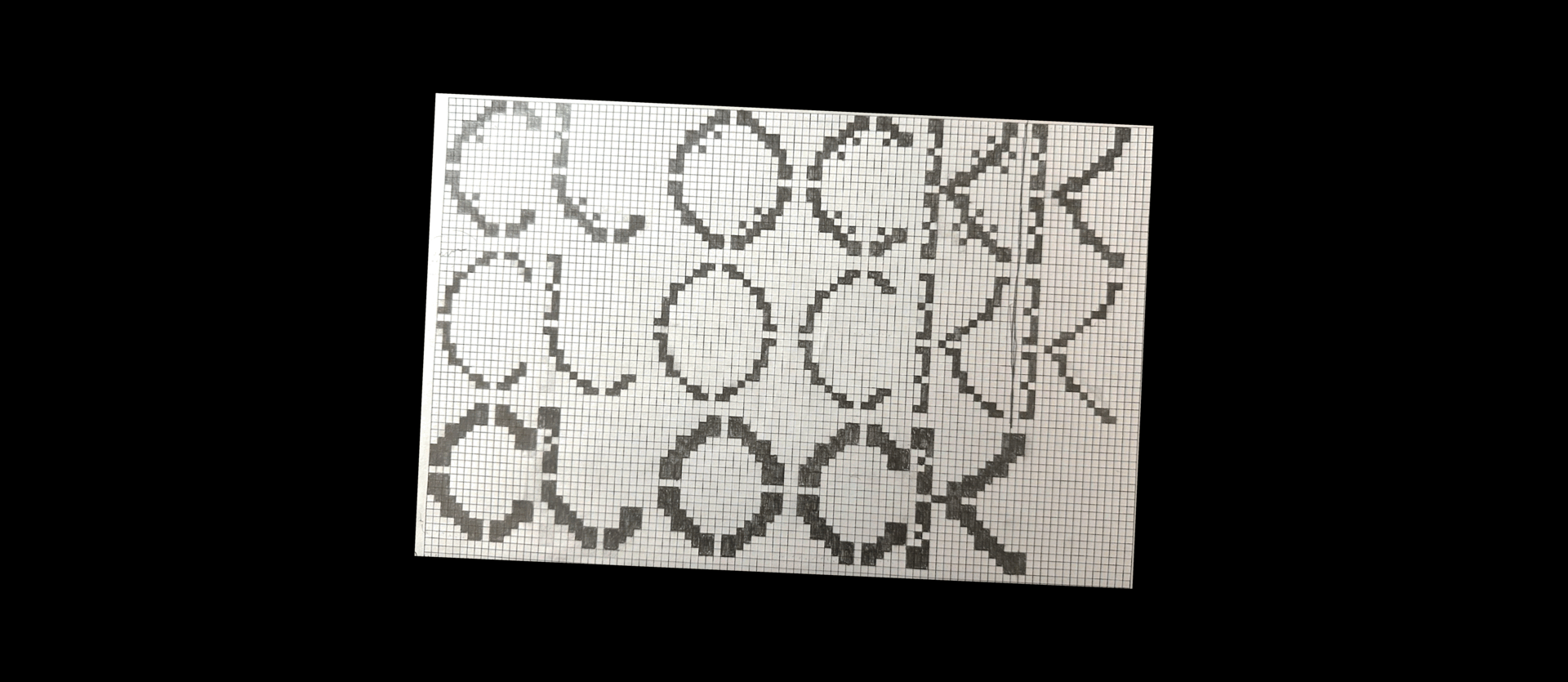
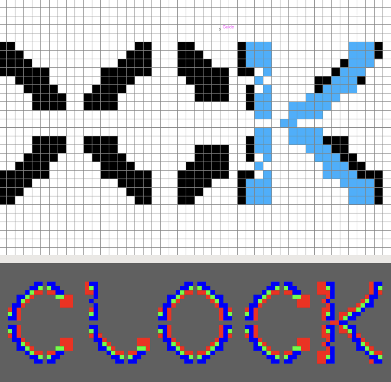
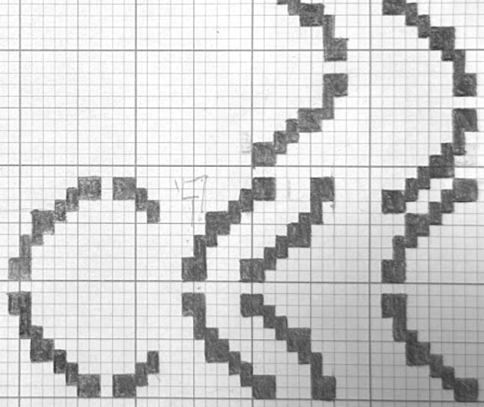
The four-hour details were not enough to make people notice that it was a resemblance of a clock. So, I brought back some more details that represent the clock, and this time, I tried to work more focused on bringing them into a sense of evolution.
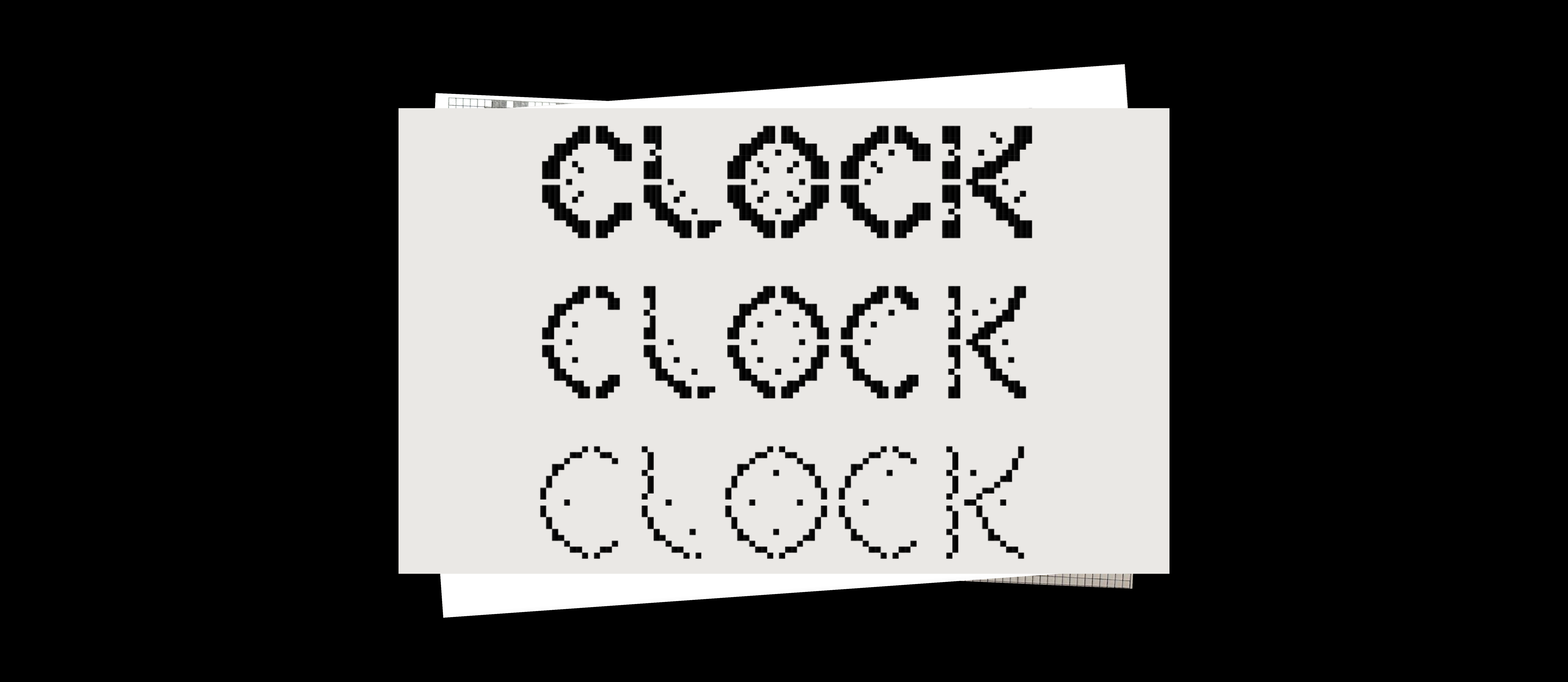
This design not only shows the involvement of movements and evolution but also gives a supporting role that brings a sense of a clock in a less literal way while still being quite obvious.
The outcome not only reflects my interest in typography design; it also showcases my fascination with the intersection of typography and motion design using Adobe After Effects. I believe that good typography with some movements can create mesmerizing visuals that tell stories or meanings in a more elevated way.